
Would you pick up a book without a compelling front cover? The answer is probably no. If a book looks good, chances are that we’ll take a look and flick through.
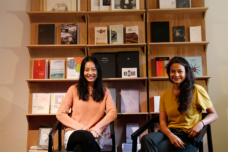
As an ardent supporter of Singapore’s literary scene, book designers Sarah Tang and Alison Schooling understand the importance of creativity for literature. They have designed covers spanning from poetry, to plays, to travel guidebooks, and even exhibition catalogues. Sarah and Alison are experts at conveying stories close to the author’s heart to readers.

But when Sarah and Alison are not in front of their computer screens reading manuscripts or laying out designs, they are hosting workshops at their studio–Itchy Fingers. Being immensely proud and involved in the local community, we chatted with Sarah and Alison about their design journey and building a community with Itchy Fingers.
1. How much has Singaporean literature grown since you first started designing for the local literary community?
We’ve designed quite a large variety of Singaporean literature over the last four years since our founding, spanning the genres of poetry, prose, plays, graphic novels and aesthetic collections. We’ve also moved onto biographies, travel guide books, exhibition catalogues and even textbooks.
There are anthologies that hit close to home, like the series Balik Kampung (edited by Verena Tay), which have references only locals might understand. In recent years, we’ve also seen more personal texts like When the End Comes Reaching by David Wong, a poetry collection that references the author’s father’s death by cancer.

2. How important is identifying a national identity for you?
As with every creative field in a young nation like Singapore, we are searching and beginning to establish a presence that Singaporeans can identify with by creating new works and lending our support to local publishers in whatever way we can. For example, does Singaporean literature have to contain ‘Singlish’ or be set in Bedok? Books like Amanda Lee Koe’s Ministry of Moral Panic have achieved critical acclaim on an international level and Kevin Kwan’s Crazy Rich Asians is currently being adapted into a movie.
No one has a clue on how the world will perceive Singaporean literature in the next ten years. The world probably hasn’t even heard much about Singaporean literature. We believe that the only way to build this identity that we’re searching for is to continue creating new work, and we’ll lend our support to the local publishers in whatever small way we can.
3. The local designing aspect for publishers is not as vibrant in comparison to U.K. What are your thoughts?
The publishing industry in Singapore is still small compared to U.K. Our authors have the benefit of working with designers on an intimate level and this helps us to understand the author’s motivations behind their work which could be visually portrayed onto their covers.
4. Which is the best project you’ve done so far?
We believe good design requires an in-depth understanding of the client’s intentions along with versatility. For this reason, we think that the best project is one that can effectively communicate what our client wants to convey.
The National University of Singapore Press provided us with quite a bit of flexibility in Arthur Yap’s series of books including The Collected Poems of Arthur Yap and Noon by Five O’Clock: The Collected Short Stories of Arthur Yap. It was a privilege to have been given the opportunity to design for one of Singapore’s pioneers in poetry. We wanted to ensure the book featured both his poetry and his artworks in an understated yet classic manner.
5. When the going gets tough, what gets you going?
There’s a quote by Elizabeth Taylor that goes,
“You just do it. You force yourself to get up. You force yourself to put one foot before the other, and God damn it, you refuse to let it get to you. You fight. You cry. You curse. Then you go about the business of living. That’s how I’ve done it. There’s no other way.”
There are times when it’s difficult and it feels like what we’re trying to do is pointless. But on the other hand, we also encounter days where we feel like we’ve accomplished great things that we can be proud of.
It helps that we both have each other’s back, encouraging and lifting one another’s spirit. What keeps us going is knowing that there’s so much more we can do, and we strive to work towards that.
6. Top 3 most inspiring book designs
6a. Quietness: Selected Works by Federico Proietti
Source unknown

Brilliant typography. Enough said.
6b. Bibliotheca
Designed by Adam Greene

Bibles have always had a very distinctive look – black leather covers, tissue thin papers, and gold-edged gildings. Greene completely deconstructed the traditional look of the bible and looked at it from a fresh angle.
6c. Pulp: A Short Biography of the Banished Book (Volume I of V)
Designed by Swell
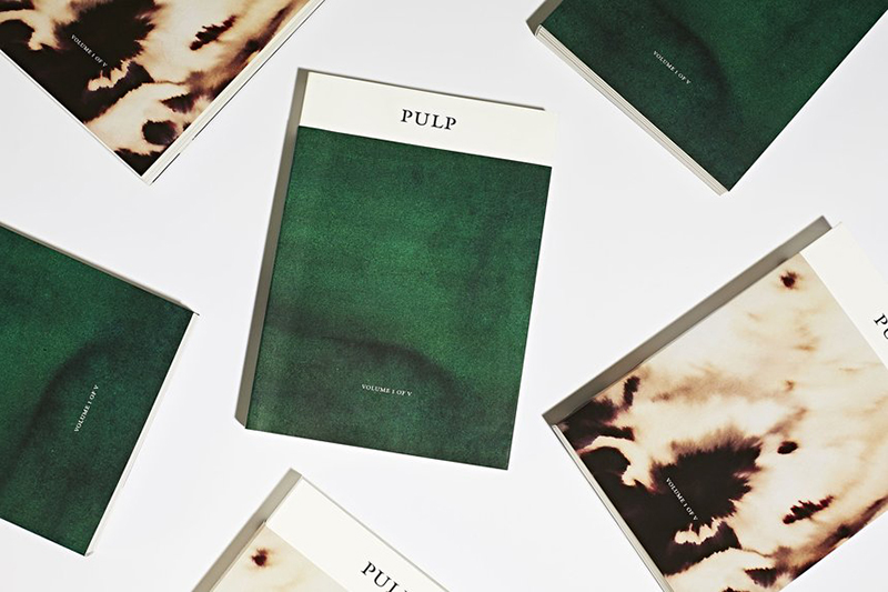
Here, its design and typography extended the subject rather than decorated it. The design has been awarded numerous times by the likes of Type Directors Club in New York and 50 Books | 50 Covers of 2016 by AIGA.
7. What are your future plans with Sarah and Schooling?
Although we specialise in graphic design, we have distinguished our identity as book designers and that sometimes works to our disadvantage. We encourage our writers to work on their branding, including business cards and websites.
Despite this, we enjoy designing books with no intention to stop. Many people have warned us that print is a dying industry but we have managed to come this far. Although print is somewhat slowing down, we believe it will never die.
Credits
Feature Image by Rachel Lim
Image 2 by Stefan Kosma
Related Articles