From modernising lingerie with Naked and Unbound to spearheading the clubbing scene in Singapore, it’s time to learn about Heng Si Hui.
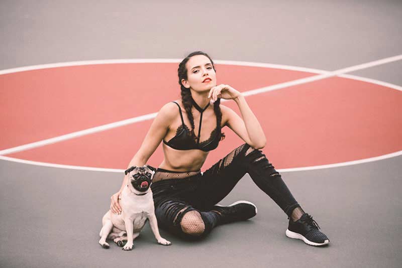
“It’s what lies beneath that matters,” says Heng Si Hui, Founder of Naked and Unbound, as she discusses her latest lingerie adventure in Singapore. Holding that motto close to her heart as the core of the business, Si Hu firmly believes in empowering women with a feeling of liberation and to live light, free and unbound.
It all started with a personal preference and in her attempt to steer away from the discomfort of underwire bras, Si Hui decided to make a change.
“Realising there’s a gap in the market where most lingerie brands do not carry pieces that cater to younger women with options that are more detailed, comfortable, sensual yet affordable, it motivated me to start Naked and Unbound.” Si Hui launched the label in 2015 on top of her day job – she’s the Creative Head one of the oldest and most popular nightclubs in Singapore and Kuala Lumpur.
Wearing two hats is never easy, but Si Hui has got it all under control. We speak to her to find out about her entrepreneurial journey and where it all began.

Can you walk us through the process of starting the business and launching a collection?
I like to propose design projects based on observation of society that will lead to the discovery of new problems being solved, as inspired by Kenya Hara, Art director of Muji. So when I noticed the gap in the market, I was motivated to address it with bras that are unbounded by wire and at the same time, it can encapsulate every notion of comfort without the compromise in the design of the lingerie.
Naked and Unbound launches 4 collections per year based on the season and it usually ranges from 3 to 6 designs per collection. They are inspired by seasonal elements, which is what hits me at the point of the design process. Recently, I launched a collection for Valentine’s Day 2017 in collaboration with local brand Augustine Good. I had fun making using leather pieces, which is her speciality whilst embedding the recent craze trend of embroidery. I manufacture everything in Singapore as I believe in quality over quantity; I want to have quality control over this process.
Can you share your thoughts on the lingerie industry in Singapore?
The Asian market is generally more traditional compared to cities in Europe and America whereby sexy lingerie or boudoir photography is still considered somewhat a taboo. So my goal is to fill this gap in the market and say goodbye to uncomfortable underwire marks.
What are some of the difficulties that you faced?
Designing a piece that fits women of various shapes and sizes can be quite a challenge as there are many factors to consider, such as; the choice of material, the shape, the cutting and more. It is not exactly the most profitable business as well as I like to keep my pieces affordable so that more young women are able to wear lingerie they can feel good and confident in.
Being the Creative Head of one of Singapore’s most renowned clubs, do you add in any elements of this nightlife in the lingerie design?
The work that I deal with is relatively different as I am trained in print and not fashion design. However, the experience through club work has helped shape thoughts behind certain designs. For instance, designing pieces that are meant to be shown when worn for certain occasions or festival. My inspiration comes from everyday experiences and my fondest memories.
I like to take visual cues from my surroundings and situations to evoke a particular emotion or feeling. As a designer, I enjoy the role of being a creator by combining different materials and textiles to form a unique story. Rumi Neely, Chriselle Lim, Victoria Beckham and Gigi Hadid are a few designers/stylists whom I look up to. Each of them has their own distinctive styles which I take reference from and further develop to my own style.
What’s the special story behind your logo design then?
The logo is designed to incorporate symbols that represent our brand. The letter “A” is inverted to mimic the silhouette of an underwear, to represent our underwear collection while “E” is refined and simplified to three strokes to represent the bra hook and buckles. Letter “O” is a play on the ideology and functionality of a bra.
Related Articles
Christina Dean: The Woman Leading a Global Movement in Fashion Sustainability
Plus Size Fashion: The Booming Retail Trend HK Is Missing Out On