
In addition to supporting people with disabilities by optimising website design and removing communication barriers, there is also a strong business-oriented case for accessible design. Here are the top 4 online accessibility tools we think your website needs.
There is often stigma towards designing a website that is accessible for people with disabilities, and it is seen as expensive, time consuming, and only beneficial to a relatively small group of people. As a result, accessibility is often sidelined as a “nice to have” feature rather than a necessity. However, there are more reasons than businesses realise for their websites to be more accessible. According to the World Wide Web Consortium, accessibility already overlaps with widely normalised practices such as search engine optimisation (SEO), user experience optimisation, and device independence. An accessible website can also enhance brand image and cater to a global market of people with disabilities worth more than US$6 trillion.
1. Add Alt Text to Images
Visual elements such as images and graphics are an accessibility barrier to individuals affected by visual impairments such as blindness and low vision. While screen readers can help these users read text, these assistive technologies are not advanced enough to automatically view and describe images in words.
Also called “alt-descriptions”, alt text is the descriptive copy that shows up in place of an image that fails to load on a website. From an accessibility standpoint, alt text helps screen readers describe images to visually impaired users. In fact, many businesses have probably already implemented this accessibility feature: alt text is typically added as a text alternative for search engines which helps boost your website’s SEO ranking.
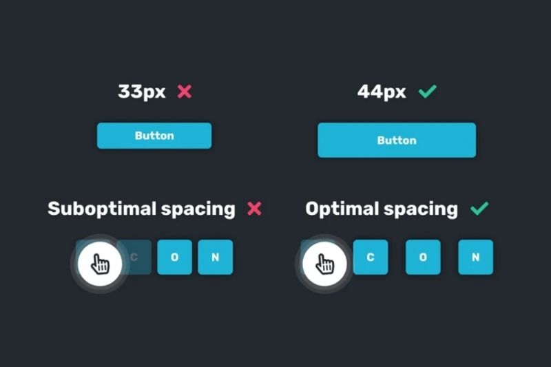
2. Large Fonts and Controls
Text and controls such as links, buttons, and checkboxes should be large enough and appropriately spaced. This way, users with motor or visual disabilities can comfortably locate elements and navigate your website with ease. Opting for more readable sans serif fonts such as Arial, Helvetica, and Calibri is also more accessible for users. Small text and buttons is an even bigger issue on devices with small screens such as smartphones and tablets, so make sure to implement these accessibility features on mobile platforms as well.
However, if you’d like to maintain a specific brand image for your website, a more accessible version can be developed where users can choose to adjust these elements to their preference.
3. High Contrast
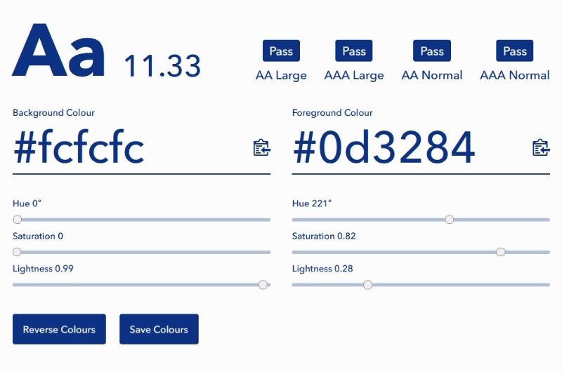
Low contrast between text and background is one of the most common accessibility concerns. Users with certain eye conditions such as cataracts, glaucoma, and colour blindness typically suffer from low contrast sensitivity, and may not be able to distinguish between text and background. According to the Web Content Accessibility Guidelines, the optimum colour contrast ratio is 7:1 for normal text and 4.5:1 for large text. To determine whether your website’s content is visible enough, you can use online colour contrast checkers that calculate the contrast between foreground and background based on each colour’s HTML hex code.
4. Keyboard Navigation and HTML Layout
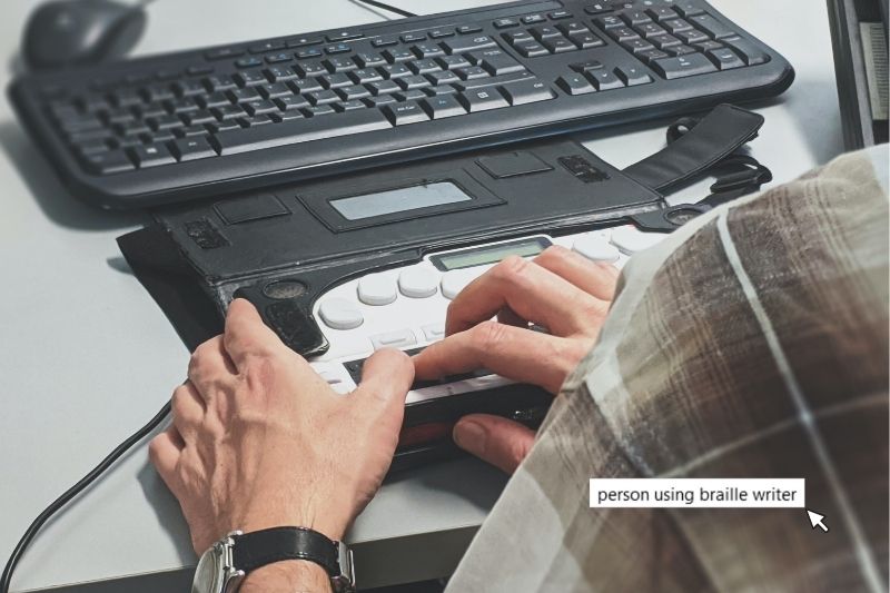
Users with motor disabilities such as cerebral palsy and Parkinson’s may lack the fine motor skills needed to operate a trackpad or computer mouse. Instead, they might opt for using keyboard shortcuts and commands to navigate websites. By using the Tab key, keyboard users can navigate through a webpage by following a keyboard focus indicator which should appear as a visible highlight or border around buttons, form fields, or search bars. An accessible website has a logically structured HTML layout so that the focus indicator moves from element to element following a logical progression. For example, in English, from left to right, and top to bottom.
One way to improve the flow of your website is to make use of headings. This will help screen readers interpret the page more accurately and give your website a better sense of structure, optimising user experience across the board.

Wrapping Up
Tim Berners-Lee, the inventor of the World Wide Web, once said that “The power of the Web is in its universality. Access by everyone regardless of disability is an essential aspect.” Web accessibility is essential for many and useful for all. As such, the internet must be designed to be accessible to all people, regardless of a user’s range of sight, hearing, movement, and cognitive ability.
Related Articles